What catches the eye in book promotional graphics? An analysis of 11 publishers
In an ad creative, every element competes for the viewer’s attention. The title, the image, the logo, an extra message or product information may all be equally important from the brand’s perspective, but that doesn’t mean the viewer will give each of them the same amount of attention.
With book promotional graphics, what’s especially interesting is how attention is distributed between the title, the author, the cover, release information and the publisher’s brand elements. In this case study we examine this mechanism by analysing 11 creatives published on Facebook by Polish publishers.

What did we examine?
The book promotional graphics combined several recurring elements. The creatives we analysed featured, among others:
What set the individual creatives apart?
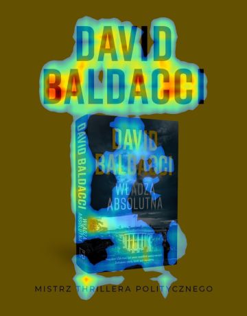
Muza
1. Author’s name: one of the strongest focal points for the eye.
2. The central text and cover: also strongly attract attention and lead the viewer to the creative’s main message.
3. The bottom tagline: remains far less noticeable.
What’s interesting? Here attention concentrates above all on the elements directly connected to the book and its author. This shows that the individual parts of a single creative can have completely different power to attract the eye.

WAB
What attracts the most attention:
1. the author’s name and the title — the main focal point for the eye,
2. the main typography — clearly directs the viewer’s attention.
Staying in the background:
3. the microphone — even though it occupies the central place in the composition, it attracts less attention than the text elements. At the same time it serves an important visual function — it links the author’s name with the title within the composition and reinforces the context of a conversation around the book.
What does this example show?
In this creative, the text clearly takes attention over the central visual element. The viewer first notices the name and the title, while the microphone stays more in the background.
Where was attention distributed differently?
The main message wasn’t always the only focal point.
In some creatives, secondary or background elements also captured attention. One example is Filia, where alongside the text a decorative element drew the eye, while the main visual motif was less noticeable.
Text and visual elements didn’t always receive similar attention.
In some creatives typography dominated, in others a central illustration or the cover. In the case of Czwarta Strona, the eye was spread across several text elements, whereas at Agora it concentrated above all on the central illustration.
Additional information often stayed outside the main area of attention.
This applied to logos, taglines, descriptive text and cover details, among others. At Poznańskie, attention focused on the text banner, while the logo and cover details were less noticeable.
What does this mean for graphic design?
The most important observation isn’t about a single element, but about the relationships between them. The fact that a viewer notices the title, the author or the release information doesn’t yet tell us how they’ll take in the rest of the creative. That’s why it’s worth checking whether the hierarchy planned at the design stage matches the actual distribution of attention — which elements are noticed first, which stay in the background, and whether attention is captured by the ones that really should attract it.
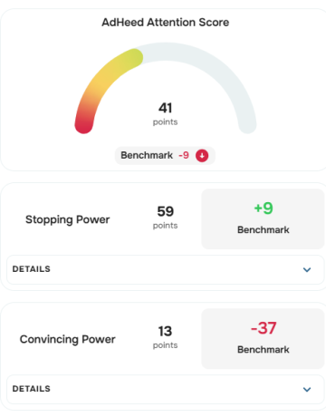
Across the group studied, the Attention Score ranged from 33 to 46 pts. This score shows how effectively the whole creative attracts and holds the viewer’s attention — the higher the score, the greater the graphic’s ability to draw attention to itself. The analysis also showed that even within a single creative, attention isn’t distributed evenly: a viewer may quickly notice the title or the author’s name, while other elements remain less visible.
AdHeed lets you bring this information together: check both the Attention Score level and the distribution of attention on a specific creative, and then use that data to optimise it before publication.